
News about A Brighter Vision: European Colour Printing 1400–1830, a project by Ad Stijnman

The past twenty-five years saw a decisive change in the study of early European colour prints. Before, focus was on 16th-century chiaroscuro woodcuts and 18th-century intaglio colour prints mainly. Recent studies have disclosed a much wider area of the use of colour in European prints and printing, challenging many earlier assumptions. The 2024–2025 Jacoba Lugt-Klever Fellowship, awarded to Ad Stijnman, was aimed at compiling a monograph on the history of European colour prints, book illustrations and ephemera from the long early modern period, (present) working title A Brighter Vision: European Colour Printing 1400–1830.
The concept texts are presently completed and edited. The volume will discuss, among many others, antecedents of European colour printing, style and function of colour prints, materials and techniques, historical terminology, and developments through the ages, These approaches offer scholars opportunities to collaborate in multi-disciplinary research projects. The study will be supported by a generous selection of illustrations of colour-printed materials covering a range of subjects, passages from primary technical sources on colour printing processes, results of instrumental analysis of objects, and quotes from historical contemporaries. Such an encompassing approach is useful to the art historian and book historian, conservation scientist and paper conservator, artist and printer, institutional and private collector.
The Fellowship was funded by the Fondation Custodia and the RKD.
The present author gratefully acknowledges the financial support for research into early modern colour prints of the Land Niedersachsen for their fellowships in 2015, 2016 and 2017 in the framework of the Kupferstichkabinett-Online project of the Herzog August Library in Wolfenbüttel and the Herzog Anton Ulrich-Museum in Braunschweig.
Preliminary
For the Contents of A Brighter Vision: European Colour Printing 1400–1830 see here (PDF, 87KB, update of 17 March 2026).
Chapters
1 – General Introduction
Approaching European colour prints from different perspectives allows multiple transverse connections to be made. In the present volume this is achieved by including explanations of ink recipes, printing techniques and printmaking processes, together with considerations of the functions and aesthetics of colour prints. Their antecedents, as well as their history in the long early modern period, are discussed. Images of colour impressions are compared, in the aggregate and in detail.
All these aspects are approached individually and in various combinations. The broader overview created in this way reveals gaps in our knowledge. Conversely it makes it possible to place particular works in their wider historical context, to debate accepted interpretations, to address unresolved issues, and to raise questions never asked before.
2 – Materials and Techniques
The present work is a study of colour-printed images and texts, a choice made on material and technical grounds. The focus of this chapter is therefore on colour ink recipes, their constituents and production, their use in printing and printmaking, and methods for their examination. In addition, coloured supports and ways of introducing colour to impressions after printing are discussed. Such an encompassing approach assists the authentication and identification of the object being examined. It provides insight into its production, the causes for detoriation, and subsequent conservation. It also links materials and techniques to the object’s style and the studio involved.
This illustrates how and why human observation, instrumental analysis, art technological source research and reconstruction research can be useful to the art historian and book historian, conservation scientist and paper conservator, artist and printer. Together, they offer scholars opportunities to collaborate in multi-disciplinary research projects. Ultimately, it is the choice and handling of tools, machines and materials that determine the outward appearance of, in this case, the colour print. This shows that style and technique are inseparable.
3 – Antecedents
The oldest surviving European print, the Sion Textile, is in colour. It is stamped in black and red inks on linen in the third quarter of the fourteenth century. This object stands at the beginning of European printing, yet it did not appear out of the blue, and its precursors have received relatively little attention in modern literature. By contrast, the history of the introduction of colour in intaglio and lithographic printing – both printing processes invented in Central Europe, in the 1430s and in 1796–1798 respectively – has received close attention in recent years and shows clear continuity.
Colour-stamped objects reached Europe from the early Middle Ages onwards. Non-black inks were used at the outset of European letterpress printing in the 1450s and colour ink recipes for stamping cloth are documented contemporaneously. It underlines the importance of first discussing possible – both non-European and European – precursors of relief printing that led to stamping cloth, printing woodcuts and metal-type letterpress in colour in Europe. This chapter therefore brings together potential precursors from prehistoric times to the fifteenth century in order to examine historical developments leading to European colour printing.
4 – Gutenberg, Le Blon, Senefelder
The chapter guides the reader through European colour printing from early fifteenth-century colour printed woodcuts, followed by Johann Gutenberg’s first attempts at red letterpress of around 1452, through chiaroscuro woodcuts, Jacob Christoff Le Blon's trichromatic printing from 1710, to Alois Senefelder's trials at colour lithography from 1708.
The history narrated here is based on close observation of colour-printed single-leaf prints, letterpress, book illustrations, print series and ephemeral printed matter. The goal is to disentangle the multiple and often parallel lines of development running through five centuries. Rarities and experiments are discussed, as well as colour prints that were produced by the thousands.
Discussions proceed from a material and technical perspective, encompassing relief printing, intaglio printing and the beginning of lithography, as indicated by the names of the most important protagonist of each process in the chapter's title. Per process a number of major themes are discussed, all in their own chronological orders.
This reaches into art- and book historical studies, includes cartography, and touches upon the histories of textiles and wallpaper, among others. Emphasis is on impressions made with oil-based inks, because this is what most surviving material is printed with. Little is know about prints made with water-based inks, because there is not that much left of them, the material is under-studied and instrumental analysis of such inks is still pending.
The history of early modern colour printing is marked by many cross-references, dead ends, revivals and reinventions. It is multi-dimensional. The range of available printing and printmaking techniques expanded during the course of the eighteenth century and grew widely in the nineteenth century. New ideas for introducing colour into print emerged continually. Accordingly, the discussion explores and identifies the curiosity of practitioners and audiences alike regarding how colour could be used in printing and printmaking.
5 – A Decade of Change
Senefelder's death in 1834 marks the beginning of a groundbreaking decade of changes. Inventions such as the automatisation of printing presses, machine grinding of ink, galvanisation, chromolithography and photography developed one after the other in just a few years time. By 1840, printing millions of sheets in colour was possible. All of this together did shape the modern graphic industry.
Appendix
For a Glossary of Technical Terms see here (PDF, 169KB, update of 26 June 2026).
For a General Chronology of European Colour Printing see here (PDF, 216KB, update of 26 June 2026).
For a Chronological Bibliography of Early Modern European Colour Printing see:
- Part I: Publications up to and including the Year 2000 (PDF, 794KB, update of 2 May 2026)
- Part II: Publications from the Year 2001 onward (PDF, 295KB, update of 2 May 2026)
Part I includes an introduction to the theme of the bibliography, and has Name, Title and URL indices on both parts at the end.
The separation at 2000/2001 is because research on the history of colour prints takes a new turn from the beginning of the 21st century.
%20pt%20I-Ink%20recipes.jpg)
Jacob Christoff Le Blon’s choice of Prussian blue for his three-colour printing system, two-minute lightning talk during the online meeting of the CHSTM/Color Studies Working Group, Wednesday, 11 June 2025, 12:00–1:30PM EDT (UTC -5:00).
For the presentation click here (PDF 2.2MB).

Ad Stijnman, A Brighter Vision: European Colour Printing 1450–1830: Een overzicht van de vroege europese kleurendruk, summary presentation of the project for the symposium Connect organised by the Grafein Foundation, at the Centraal Museum, Utrecht (The Netherlands), Saturday 21 February 2026, 11:00–17:00 h. (30 min., during the afternoon).
For the flyer click here (PDF 2.2MB).
Ad Stijnman, A Brighter Vision: European Colour Printing 1450–1830: Ein Überblick über die Entwicklung des europäischen Farbdrucks, summary presentation of the project organised by the Forschungszentrum Historische Geisteswissenschaften of the Johann Wolfgang Goethe-Universität, Frankfurt am Main, and the Johannes Gutenberg-Universität, Mainz, at the Johannes Gutenberg-Universität, Mainz (Germany), Tuesday 3 March 2026, 18:00–19:30 h. With additional workshop basic intaglio printmaking techniques at the Kunsthochschule Mainz, Wednesday 4 March and Thursday 5 March 2026, each day 10:00–17:00 h.
For the flyer click here (PDF 2.4MB).
For the presentation click here (PDF 21.8MB).

Ad Stijnman, 'Printmaking manuals for amateurs' (working title), presentation for Amateurkunstenaars op papier (1600–1850) (working title), annual symposium of Delineavit & Sculpsit, Teylers Museum, Haarlem (The Netherlands), Friday 12 June 2026.
For registration and programme see: https://teylersmuseum.nl/nl/zien-en-doen/symposium-or-in-de-marge-werken-op-papier-door-nederlandse-en-belgische-amateurkunstenaars-ca-1550-1850.
For the presentation click here (PDF 2.8MB).
Recent and forthcoming publications
For earlier publications on the subject see Recent publications, under Colour printing history.

Ad Stijnman, ‘Not for the Feeble of Mind! Color-printed Illustrations in European Medical Literature, 1500–1850’, in Placing Prints: New Developments in the Study of Print, 1400–1800, ed. by Bryony Bartlett-Rawlings and Naomi Lebens, Leiden, Boston: Brill, 2024, pp. 117–140 (Brill's Studies on Art, Art History, and Intellectual History; 74).
§ This essay discusses early modern European medical illustrations printed in colour that are held in the Herzog August Library in Wolfenbüttel, in comparison with single-sheet artistic prints housed in the collection of the Herzog Anton Ulrich-Museum printroom in nearby Braunschweig, both in Germany.
For a description of the volume and its table of contents see: https://brill.com/edcollbook/title/62165?rskey=UspUgT&result=1.

Ad Stijnman, 'The Printshop of Jan Pietersz. van de Venne, Middelburg, 1623', in Maker Space: Creative Environments in Early Modern Europe, ed. by Colin Murray, Sophie Pitman, Tianna Uchacz, New York: Bard Graduate Center Press, (forthcoming 2026).
§ Discussion on references to trade, religion, craft, culture, and government in this printshop interior.
See: https://press.uchicago.edu/ucp/books/book/distributed/M/bo216866307.html.

Ad Stijnman, '"Jaune soufre & acide bleu": over Ensors etstechnieken', in Staten van verbeelding: Ensor en het grafisch experiment, exh. cat., Antwerpen: Museum Plantin-Moretus, 2024.
Exhibition: 28 September 2024–18 Januari 2025.
§ On the etching techniques of James Ensor (1860–1949), including printing in sanguine (red-brown) and on coloured fabric.
See: https://museumplantinmoretus.be/en/activity/states-imagination.


Ad Stijnman, 'Colour Letterpress in the Long 18th Century: A First Survey', in Printing Colour 1700–1830: Histories, Techniques, Functions and Receptions, ed. by Margaret Morgan Grasselli and Elizabeth Savage, Oxford: Oxford University Press, 2025, pp. 73–83 (Proceedings of The British Academy; 263).
§ Includes: 'A bibliography of publications with colour-printed letterpress, 1697–1829', a list of annotated short-title descriptions of thirty prominent examples of books and periodicals with colour-printed texts.
For a description of the volume and its table of contents see: https://global.oup.com/academic/product/printing-colour-1700---1830-9780197267530?q=printing%20colour&lang=en&cc=nl#.
For an interview with the editors see: https://www.youtube.com/watch?v=FHzceU41uvI.
The volume has been awarded Honorable Mention in the 2026 International Fine Prints & Drawings Association (IFPDA) Book Award programme.
Ad Stijnman, 'Anatomy to Embroidery: Intaglio Colour-Printed Illustrations in European Books and Periodicals, 1700–1850', in Printing Colour 1700–1830: Histories, Techniques, Functions and Receptions, ed. by Margaret Morgan Grasselli and Elizabeth Savage, Oxford: Oxford University Press, 2025, pp. 315–328 (Proceedings of The British Academy; 263).
§ Subjects discussed: Anatomy and pathology; Botany and zoology; Portraiture; Art and artistic instruction; Fashion; Fiction and poetry; Devotion and religion; Militaria and cartography; Palaeography; Archaeology and history; Travel, discovery, and ethnography.
For a description of the volume and its table of contents see: https://global.oup.com/academic/product/printing-colour-1700---1830-9780197267530?q=printing%20colour&lang=en&cc=nl#.
For an interview with the editors see: https://www.youtube.com/watch?v=FHzceU41uvI.
The volume has been awarded Honorable Mention in the 2026 International Fine Prints & Drawings Association (IFPDA) Book Award programme.

Ad Stijnman, 'Of Furm and Mulde: A Bibliography of Primary Sources on the Production of Stamping and Relief Printing Woodblocks, 1400–1700', in Printing Things, ed. by Elizabeth Savage and Femke Speelberg, Oxford: Oxford University Press, (forthcoming 2026).
§ The bibliography presents in chronological order the first annotated compilation of 31 textual and visual sources that were written, drawn, and printed to detail the production and printing of woodblocks in Europe from 1400 until c.1700, including sources on stamping fabric in colour and on chiaroscuro colour printing. Texts are transcribed, translated into modern English if in a non-English language, and annotated. Images of the production of wooden stamping and printing matrices are reproduced, described and annotated.

Ad Stijnman, 'European and Asian Typographic Printing Inks, 1200–1600: A Comparison', Chapter 12 in From Jikji to Gutenberg: The Origins of Book Printing from Cast-Metal Type, ed. by Cathleen A. Baker and Randy Silverman, Ann Arbor, MI: The Legacy Press, 2026.
§ The Chapter includes an Appendix with an 'Annotated bibliography on the technical examination of printing ink in incunabula', with titles from 1940 to the present.
The similarity between early Korean and early German typography is printing from loose metal type. However, there are many fundamental differences between both processes. This chapter compares the different printing ink recipes they used: a water-based ink in Korea and an oil-based ink in Germany. It also includes a discussion on European red printing ink and black/red printing processes. By absence of contemporary documentation the discussion grounds itself on observation and on modern technical analyses of the inks and printing processes in the earliest Korean and German printed books. The aim is to define these earliest inks in more detail by looking at their principal constituents: pigments, binding media and possible additives. The antecedents of these inks are discussed and what possible changes may have been necessary to adapt earlier ink recipes to make them suited to print from metal type. All together this will support the discussion in how far both typographic processes may correspond or differ.
Available at: https://www.oakknoll.com/pages/books/143043

Ad Stijnman, 'Innovation, Revival and Re-Invention: Early European Colour Printing Processes in Perspective', in Rethinking Colour: Printing Colour and Painting Prints in the Fifteenth and Sixteenth Centuries, ed. by Karolina Mroziewicz, Małgorzata Łazicka, Leiden: Brill (forthcoming 2026).
§ Colour was an integral part of printmaking from 1400, first by hand-colouring prints inked in black and from the 1450s by colour letterpress. Next followed a period of experimentation with colour printing in both relief and intaglio. This paper discusses developments of colour printing techniques in Europe until 1600, placing these in perspective by comparison with works from earlier and later periods.

Ad Stijnman, '[The Etching Techniques of SHIBA Kōkan and AŌDŌ Denzen]', in [Cool Oil Paintings: SHIBA Kōkan and AŌDŌ Denzen], ed. by KANEKO Nobuhisa, transl. by OTO Yumiko, exh. cat., Fuchū, Tokyo: Fuchū Art Museum, 2025, pp. 012–016.
Exhibition: 15 March–11 May 2025.
§ In the course of the eighteenth century Japanese rangakusha (Holland scholars) studied Western sciences, thereby implementing it in their own scholarly system. Similarly, Japanese artists taught themselves Western art techniques such as drawing perspective and oil painting. In 1783 SHIBA Kōkan (司馬 江漢) introduced etching and printing copper plates. Other printmakers modified this by applying locally available materials and AŌDŌ Denzen (亜欧堂 田善) excelled in technical creativity, including printing on fabric and colour printing. For almost a century, until the arrival of Italian engraver Edoardo Chiossone in Japan in 1875, nearly a hundred Japanese artists created thousands of unique etchings independent from any training by a Western artist.
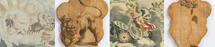
Ad Stijnman, 'Color Printed Cloth from the Teyler Workshop', for Premodern Printing on Fabric (working title), exhibition at the Newberry Library, Chicago, December 2026 to April 2027 (details forthcoming).

Ad Stijnman, 'Burning Oil: The Historical Production of Oil Varnish for Printing Ink' (working title), in D’encre et de feu, vol. 1 (2025), no. 1 (Sept., forthcoming 2026).
§ This contribution is a revised and adapted version of part of the chapter ‘Materials and Techniques’ in: Ad Stijnman, A Brighter Vision: European Colour Printing 1450–1830.